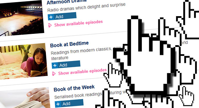
For some time now I have refused to accept the prompts to use the "new look" BBC radio player website interface and I was disappointed to discover recently that the old one had been retired and I'm no longer given the choice.
Too Many Clicks
Suffice to say, the new version just isn't as good, because it makes every listening choice harder to find.
Organising large amounts of information is very difficult and on any given day the BBC have many programmes you can listen to. But what's galling is that this information used to be organised so well. It was intuitive and easy. The focus of the new design is to make programmes more accessible to mobile devices, but it has sacrificed much of its intuitive ease in the cause of progress.
What is the Book of the Week?
For example, looking at the array of available Radio Drama programmes on the site right now, they include "Drama on 3", "Classic Serial", "Book at Bedtime" and "Book of the Week".
Fair enough, but what exactly are they? What is the Book of the Week? I have to click it to find out.
As for the Book at Bedtime, I click on it and go to a new page to find out that the earliest available episode is Part 11 of 20. If I knew that episode 1 had expired already, I needn't have bothered clicking on it.
With the old system, the names of the books being read and the plays being performed were available in the Drama listings, not just the generic umbrella series title. Moreover, the page told me which episode was the latest and there was a little link labeled "5 more" or "3 more" which I could click on to expand without leaving the page.
Another example right now is Casino Royale.
- Seeing the title, I think to myself: "Sounds good" and so I click on it (count: 1 click)
- which takes me to episode 5. But I want to listen to episode 1. So I click on the Episodes tab (count: 2 clicks).
- Then I have to scroll all the way down to the bottom of the page to find episode 1, because episode 10 is at the top. I've got two hours left to listen to episode 1. So I click on episode 1 (count: 3 clicks).
- That has a graphic saying "Listen Now", so I click that (count: 4 clicks).
It was entirely superior to this new system, which requires me to click back and forth between pages to find what I want to listen to.
That's not all. The Casino Royale episode 1 page doesn't have a link to episode 2. So I have to go back to the Episodes tab to click on the episode 2 link. Another two clicks where once there used to be one.
Worse is to come.
- I click on Charles Chilton - Journey Into Space (count: 1 click).
- The current programme is episode 4, but I want to hear it from the beginning. I click on the Episodes tab (count: 2 clicks).
- There are three different series available. I have to click back to find out which series is currently being broadcast (count: 3 clicks).
- Having ascertained that it's a series called "Operation Luna" I go back to the list (count: 4 clicks)
- and click on the right series (count: 5 clicks).
- On this page for some reason there's not a list of episodes, but there's a carousel in which episode 4 is displayed by default. So now I have to click to get to episode 3 (count: 6 clicks),
- then episode 2 (count: 7 clicks),
- then finally episode 1 (count: 8 clicks).
Another example of system failure is Ben Moor - Undone. I clicked on that to find out more only to be told "This programme is not currently available on BBC iPlayer Radio". Why is it in the list, then?
The formula is simple. More clicks = a worse user experience.
I realise the old version of the radio player system is never going to return but I strongly advise the BBC to reinstate some of the useful functionality that interconnected radio programmes in a meaningful way.
On the upside, I'm really pleased to see that song titles and artist names are now displayed in real time when I listen to music radio, rather than having to wait till the following day to see a full tracklisting. That is a big improvement that doesn't impact on me finding what I want and it's a delight.
