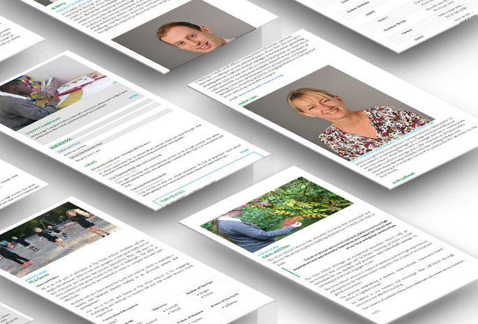
You have to exercise a little imagination when you visit The Wren School on the Bath Road in Reading.
Right now it's a few temporary structures surrounded by a vast building site. The brand new Reading secondary school opened its doors in September for the very first day and so far it only accommodates Year 7 students (age 12), but those youngsters will form the foundation of a very ambitious new institution built to service the needs of the growing West Reading community.Next year they'll have Year 7 and 8. And in 2017 they'll have Years 7, 8 and 9. And those lucky young people will be moving into a brand new, purpose-built school with state-of-the-art facilities. By the time they reach Sixth Form age, there will be more than 1,200 students at The Wren School.

inframes.com was commissioned to build a new website for The Wren School to take over from the interim site that serviced their needs before they opened their doors. We were given the go-ahead at the start of term and the site went live today, November 11th.
The design imperatives were simplicity and accessibility, with high-contrast colouring and clear navigation, for desktop, tablet and mobile devices. And we've made the best use of the bright colours from the school logo and the photos taken by teachers in class to make the site lively and youthful but seriously professional. We built the site using Wordpress, at the school's request, and we used Bootstrap as the framework under the hood.
Schools don't have inexhaustible budgets, so another imperative for The Wren School was that their website should be simple to update, allowing them to take over immediately, even by staff with minimal experience of Wordpress. But of course we're always here to help if we're needed, because we never hand over a website without the offer of free, no-strings help and advice.
We're very honoured to be selected for such a prestigious project, especially as The Wren School is less than a mile from the inframes office, making both institutions very much a part of the same proud and thriving community.
Work in Progress
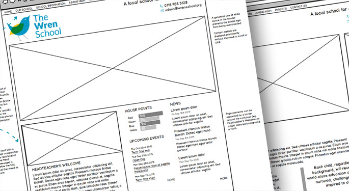
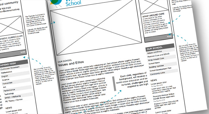
We often start the design process by building "wire frames" that allow us to agree the specifics of the website structure with the client before we move on to the fun stuff like colours, fonts and photography. The wire frames are used to make vital decisions about layout, dimensions and navigation so that the graphic designer doesn't waste time at the next stage.We currently use Balsamiq to make our wire frames. Here's what they look like:

You might notice blue, dashed arrows overlaying some of these drawings. These are used for annotations around the layout. The wire frame is a good stage of the process not just to show what we're going to do but to explain to the client why we think it's the wisest way to do whatever we're doing.

Credits:
Jon Ewing, Designer & Developer
Edward Couldwell, Graphic Design
Thanks to Graphic Burger for the PSD action used to create the mock-ups at the top of the page.
