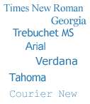
My choice for this page is in keeping with common blogging design, so I haven't gone out on a limb. But seeing as I often find myself explaining to clients the relationship between fonts and web pages, this seems as good a time as any to put it all in writing.
The more observant among you will have noticed that the design of this blog has changed since this article was written. I decided to go out on a limb after all. If you can't tell what fonts this page is using now, I recommend you download the useful browser tool WhatFont. Or you can just ask me
In web design I do not have the luxury of choosing any font I fancy for my pages because your browser needs to be able to locate the appropriate font file on your hard drive. If you're currently reading this text in Arial, that's because you are using a computer that has Arial installed on it. If you're reading this in Helvetica (and congratulations if you can tell the difference - you are quite the typography expert) then it's because you have not got Arial installed.
Practicality

So, returning to my opening remark, the font family for this text you're reading is specified at the top of the page (hidden in the code, of course) as a list of two fonts. In this case: "Arial, Helvetica". Quite simply, this tells your browser to display the text in Arial if the font is available. If it isn't, the browser should use Helvetica instead. It's second place because (a) the majority of people have got Arial installed and (b) because Helvetica is so similar to Arial that it won't adversely affect the page layout if Arial is absent.
While I might have hundreds of fonts installed on my computer, it's possible you might not. Even if you have, you probably won't have the same fonts as me. So that means I am quite limited in my choices.
See the Appendix at the bottom to find out just what those choices are.
Convention
In its short history, the web has already seen a lot of trends come and go. Along comes the Blink tag and suddenly everyone's using it. Equally suddenly, it becomes a bit of an embarrassment. To a designer, it's a no-no.
When I started making web pages, there wasn't a font tag. Hard to believe now, isn't it? You decided what font you wanted to use in your browser settings. So for most Windows users, the world wide web was all in Times New Roman, because that was the default.
The font tag came along in 1995 along with the first wave of people practising "web design" as a career. And those designers led a mass migration away from Times New Roman. Probably because we were sick of the sight of it. Pretty soon, everything was in Arial. Within a year, Microsoft had extended the breadth of choice by introducing its Core Fonts package. These fonts were made freely available and were specifically designed to look good when rendered in a web browser. They included Trebuchet MS and Verdana as a change from Arial, plus Georgia to give us an alternative to Times New Roman.
Oddly, though, professional designers have never embraced Comic Sans in quite the way amateurs have. Mums creating invitations to their infants' birthday parties seem to love it. If you let your teenage nephew make your company's website, there's no bigger give-away than the presence of Comic Sans on the page. (See Fighting the good fight against a very bad font)
Style
But is Comic Sans really that bad? Who am I to say. All I know is, I'd be a brave man to present it to a client as part of a creative pitch. Convention, or for want of a better word, fashion, dictates the paramenters of the designer's choices much more than any personal choice.
This is especially true with a commercial website, which almost always necessitates a conservative approach. A customer expects your website to adhere to certain conventions of layout, navigation and design, so deviating from those conventions means you risk losing their business. Brave indeed.
But what of style? Individuality? Without pioneers in web design, those conventions would remain static forever. Moreover, by apeing bigger, more established websites, web designers do nothing more than condemn their websites to being forever second-best, unprepossessing and forgettable. So maybe it's time to be brave and lead the resurgence of Times New Roman on my next project. But not Camic Sans. I'm not as brave as all that.
Font Tips
- Less is more. As a rule of thumb, two different fonts on a page is usually ample
- Think about colour. It can be a striking alternative to using bold face or italics
- Size is important. Text can be clearly emphasised or de-emphasised by its size and by the amount of space around it, without changing the font or colour
- Watch the width. A paragraph becomes very difficult to read when there are more than twelve or thirteen words on each line
Appendix
There's a list of common fonts here:
http://www.ampsoft.net/webdesign-l/WindowsMacFonts.html
And these pages list the fonts that come with Office and/or various versions of Windows:
http://support.microsoft.com/kb/837463
http://support.microsoft.com/kb/924623
And these pages list the fonts installed by Mac OS X:
http://support.apple.com/kb/HT2444?viewlocale=en_US
http://en.wikipedia.org/wiki/List_of_fonts_in_Mac_OS_X
