That's because the computer you have now has a relatively high resolution compared to how it used to be when the site was first designed. And most other people will be seeing the same thing, so perhaps it's time you brought your site up to date.
A few years ago, it was a good idea to make web pages just under 800 pixels wide. That ensured it would look good in a resolution of 800 x 600, which was pretty common for a lot of people.
It's worth pointing out that a web page with a width of 800 pixels is too wide for a screen with 800 x 600 resolution. That's because you have to allow for the window edges on the left and right and the scroll bar. So around 770 pixels or 780 pixels wide would be a safe bet.
However, since then, you've got a better computer, right? And chances are, you have your screen set at a considerably higher resolution.
Personally, I use dual monitors, one set to 1600 x 1200 and the other 1280 x 1024. Today, if I set my screen to 800 x 600, it looks hilarious. Icons become the size of dinner plates.
I would consider a reasonable width, by the standards of the average computer resolution settings, to be a little over 900 pixels.
guardian.co.uk is 940 pixels wide, for example, which means that it sits quite neatly on the page even if you've got a resolution of 1024 x 768. If you go below that, to 800 x 600, you get sideways scroll.
Sideways scroll is the enemy and it must be stopped.
So the short answer is, a web page width should be about 950-ish pixels.
Here are some illustrations.
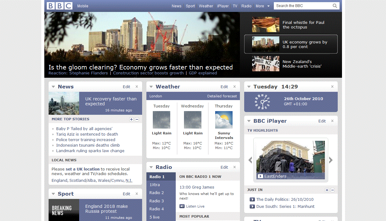
Here's what I see when I visit the BBC website if I have my browser full-screen at 1600 x 1200, which is the resolution I work at every day. Note the grey space round the edges, because that will disappear in the later screengrabs.
1600 x 1200

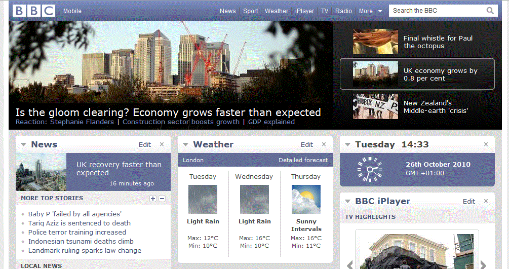
Now see what it happens when we drop down to 1280 x 960. Note how the bottom of the page has now dropped under the bottom of the screen, but you've still got a lot of grey space round the edges.
1280 x 960
Now we go to 1024 x 768. This is probably the resolution I would have used about seven or eight years ago. Note that all that extra space on the left and right margins has vanished and we have now lost more than half the page at the bottom of the screen.
1024 x 768
So there you have it.
Like I say: the short answer is make your page a little under 1000 pixels wide and everyone should be happy. I wouldn't go higher than 1000 pixels.
Web page widths of famous-name sites:
thetimes.co.uk - 978 pixels
microsoft.com - 932 pixels
cnet.com - 986 pixels
bbc.co.uk - 995 pixels
You could go for a "liquid" width but you're in for a world of pain, design-wise. That's another can of worms!
It then just comes down to how much content people are going to see vertically, which you have no control over. It depends entirely on the resolution of their screen. In the examples above, about 55% of the page disappears below the scroll line as the resolution of the screen decreases. Yes, you did read that correctly - it's not a typo. Well over half of the homepage disappears below the bottom of the screen.
That said, it's very wise to make the most of the top 500 pixels. To find out more about that, read my article on Above the Fold design.