Jolly Good Websites for Reading Businesses Established October 1999
Tel. 0845 6445513 (national) Tel. 0118 9507617 (local)

Wednesday 2 December 2009

BNI 60 Seconds - Moving Your Website Made Easy

BNI

Each week in our BNI lunchtime meeting, I am expected to get up and tell other members and visitors a little bit about my work in a sixty second snapshot.

If you want to find out a bit more about our weekly meetings, skip to the bottom of this page.

Here's what I had to say this week:

"My name is Jon Ewing and I am from inframes.com ltd, a website design and development company from Reading established more than ten years ago.

"You should refer business to me because I offer a reliable, friendly and personal service at the competitive rate of just £35 per hour.

"This week we've been moving one of our longstanding client's websites to a new server. This can be quite a headache which is why a lot of companies never bother to review their website hosting. But by using our best practice checklist we ensure the minimum possible downtime during the transfer process, which in this case was nil. And our client is now able to take advantage of much more advanced server technology for less than the price he's been paying for eight years.

"So this week I'd like you to refer someone to me who hasn't reviewed their website hosting for five years or more. We can offer a state-of-the-art email and web hosting package, based in one of our partner server farms in London or the US or even both, for between £30 and £50 per month.

"To find out how good your website could be, look into inframes."


What's BNI?

I am one of half-a-dozen people who have started a new chapter of the BNI business networking group and we're looking for other Reading-based small business professionals to refer business to.

We meet between 12.15pm and 1.45pm on Wednesdays. If you'd like to come along to a lunch, please drop me a line or give me a call and I'll put you in touch with our organiser.

There's absolutely no commitment required – you just pay a tenner, which covers the cost of lunch at the Strada on the Oracle Riverside - and you'll have a chance to meet existing members and other visitors, introduce your business and of course hand out business cards.

Monday 30 March 2009

Getting The Title Right

Part three in a new guide to search engine optimisation

For those who don't know, the title of a web page is hidden in the page "head" and it should be present in every page you create. It doesn't appear on the page as part of the layout, but users will see it in the title bar, which is the bit across the top of their browser.

There are a few rigid rules to follow when coming up with a title for your page. The ideal length of a page title is 60 to 65 characters, including spaces. Any more than that and...
  • it may not fit in the title bar of the web browser and more importantly

  • it may be truncated in Google's search results with an ellipsis...
Include your chosen keywords where appropriate. Don't repeat keywords gratuitously, but don't be afraid to reuse variations on a word where you think it's legitimate. For instance: "Divorcing your partner: Divorce and separation advice for women".

The most important thing to consider when writing titles isn't to get the perfect number of characters, nor is it to shoe-horn your top keywords into every one. And for heaven's sake don't make your company name the first word of every title unless your company name is your top priority keyword. No, the most important thing is much harder and more time-consuming: good copywriting. Your page title should be snappy, factually specific and intriguing. It must be brief and where appropriate it should be witty, smart, clever and original. Why? Because the people who you want to get noticed by are just like you: discerning and sceptical experienced Googlers.

We are All Google Experts...

Yes, it's true. We're experts at Googling. We do it all the time. I use Google so often every day that I take it completely for granted. It's near impossible to recall a time when I had to go to the library to look things up in a book. The very idea has become anathema for all but the most studious academic research. And as a result of using Google so often, I know a good search result when I see it.
Search results usually divide into three categories:
1. Perfect match: exactly what I wanted. Thank you Google, you came up trumps again.
2. Worth a look: this page quite possibly won't answer my question, but I'll chance my arm
3. Way off: I'm only going to click on this if I'm really desperate
So what we're trying to achieve with search engine optimisation is not so much putting your site at the top of the list, but putting your website into that first category. Or is it?

...But We're Not Experts in Everything Else

Sometimes when we're searching for information, we don't quite know where to begin. Looking in my recent search history, the queries range from the very specific ("download vista widget measure IP traffic" or "Enfocus Instant PDF 08") to the desperately hopeful ("what do I do when Outlook tells me there is insufficient space to store my rules?"). The latter type of query can introduce a sort of randomness into your search results which it may be possible for us to capitalise on. If your search results contain nothing but category-three pages, then despite the lack of apparently useful links, you'll probably still click on one or two of them, starting with the one that comes closest to what you wanted. And so the page title will be vitally important to your decision - you'll be looking for something that's brief and to the point and promises a page that is useful and informative.

So, one might argue that the best page title is not necessarily one that puts your site at the top of the search results for your chosen keywords. Obviously that's an important factor, but surely it's equally important that your page title stands out from the listings when someone searches for other keywords - ones you haven't prioritised, but which may be equally likely to lead to a sale.

Contents
Part One: Google Is Your Friend
Part Two: The Cream Will Always Rise to the Top
Part Three: Getting The Title Right

The Cream Will Always Rise to the Top

Part two in a new guide to search engine optimisation

In part one I concluded by remarking that Google rewards the more prolific and up-to-date webmaster.Which leads me to my second point and the most important factor in search engine optimisation: content is king. So if you've got 150,000 pages of detailed information about Lambretta parts, you shouldn't need to worry too much about a rival upstart with a six-page website, no matter how well optimised it might be.

Which is not to say there aren't tricks to improving what you've already got. Of course there are. But Google will be most impressed by a wealth of relevant information - that's how it recognises true quality.

LycosLycos RIP: a Note On Other Search Engines

Incidentally, before I go any further, and as they like to glibly say on the BBC, other search engines are available. There's Yahoo! But Yahoo! never strictly speaking had its own search engine anyway. And there's Microsoft's Live Search. It's not a complete monopoly. But the plain truth is that search engine optimisation is all about getting the highest possible ranking on Google, isn't it? That's how your customers are going to find you, so let's not beat around the bush.

If you've been in this business a while, you'll remember when the names Infospace, Altavista, Excite, Hotbot and Webcrawler were all movers and shakers in the internet portal industry. Back in 1998 I paid a visit to Excite's massive headquarters in Silicon vallery, not far from San Francisco, and at that time they were second only to Yahoo! in the internet biz. Little did they know that just up the road a little company called Google Inc would ultimately witness Excite being bankrupted, broken up and largely forgotten (although the brand still persists to this day in both the USA and Europe). Lycos.co.uk - which not so long ago was being advertised on prime-time television such was the investment in its branding - closed down its UK portal operation in February 2009 and its website now offers nothing more than pointlessly rebranded Google search results. One day Google itself just might end up the same way. Nothing lasts forever. But for the sake of argument, let's just say that when I talk about Google I'm talking about search engines everywhere and you can draw your own conclusions about how important those supporting roles might be compared to the protagonist in this story.

Contents
Part One: Google Is Your Friend
Part Two: The Cream Will Always Rise to the Top
Part Three: Getting The Title Right

Google Is Your Friend

Part one in a new guide to search engine optimisation

Slideshow of some of Google's more interesting Commemorative Logos

The first thing I usually say to people who want to improve their Google ranking is that Google is not your enemy.

What I mean is, Google wants you to get the ranking you deserve. It's in their interest.

Unfortunately, search engines have learned over the years to treat your claim to higher ranking with a healthy dose of scepticism.

Years ago, it was easy to cheat the system. For instance, webmasters who were either unscrupulous or enterprising, depending on your point of view, discovered that if you put a block of white text on a white background at the bottom of your homepage, you could fill it with hundreds of key words that would be ignored by visitors but indexed by search engines.

That's where the battle began and why perhaps you, in common with many web publishers, might have the attitude that Google is not on your side. Search engines began to penalise tricksters. Which naturally has led those tricksters to start new websites in which they would devise more devious measures to hoodwink the search engines, causing the search engines to penalise them further still - and so it goes on.

But let's look at it another way. Let's assume you are a legitimate company. You have a substantial web presence that is at the core of your business, either as a method of communicating with or selling to your customers, or both.

Let's say your website is the world's best source of information on the topic of vintage Lambretta spares. The brains behind Google don't want it to be on page five when someone searches for the words "vintage Lambretta spares". Of course they don't. It belongs at the top of the list and they didn't get where they are today by allowing jumped-up amateurs to muscle in on your business.

So, Google is the friend of the web publisher - so long as he's hard-working, up-to-date and prolific, that is.

Contents
Part One: Google Is Your Friend
Part Two: The Cream Will Always Rise to the Top
Part Three: Getting The Title Right

Thursday 5 February 2009

Google's New Look

You might not have noticed but Google has changed just a little - it's got a new favicon.

The favicon, for those who don't know, is a little square graphic measuring 16 pixels along each side that appears in the location bar of your browser when you visit the site like so:

IE location bar showing Google web address and favicon

What's the point?

Well, it's far from essential to your website, but if you're lucky enough to have someone bookmark your website, the favicon will appear in the Bookmarks or Favourites menu like so:

IE favourites menu showing Google and inframes.com favicons

and it also appears on the tabs. Here's how it looks in Google Chrome:

Google Chrome tab showing inframes.com with favicons


Google's favicon has changed twice in the last year or so (chronologically from left to right):
Google favicon (enlarged to 80 x 80 pixels)Google favicon (enlarged to 80 x 80 pixels)Google favicon (enlarged to 80 x 80 pixels)
Favicons are quite simple to create using Photoshop, although it's trickier than you might think creating a work of art that's no more than 16 pixels across. personally I think Google's new favicon calls to mind the London 2012 logo crossed with the South African flag, but maybe that's the look they were going for.

You can make one yourself using Photoshop by downloading this free plug-in from Telegraphics
Favicon maker - Create a favicon from any image


Alternatively, there are at least a couple of websites with free tools you can use to make your own favicons, one from Dynamic Drive and another from RealWorld Graphics.

For regular Google news, you can check the official Google blog. Recently they've announced the new version of Google Earth, which now allows you to explore the sea bed as well as the stars, and there's a new widget from Google News that allows you to very simply put customised news headlines on your website for free.

Wednesday 4 February 2009

Which font? A question of practicality, convention and style

The font family I have chosen for this blog is Arial/Helvetica, with the titles in Georgia/Serif. If you don't know what that means, read on because I'll be explaining it in this article. And as the title suggests, I'll be looking at three things to consider when choosing fonts for a web design project.

My choice for this page is in keeping with common blogging design, so I haven't gone out on a limb. But seeing as I often find myself explaining to clients the relationship between fonts and web pages, this seems as good a time as any to put it all in writing.


The more observant among you will have noticed that the design of this blog has changed since this article was written. I decided to go out on a limb after all. If you can't tell what fonts this page is using now, I recommend you download the useful browser tool WhatFont. Or you can just ask me


In web design I do not have the luxury of choosing any font I fancy for my pages because your browser needs to be able to locate the appropriate font file on your hard drive. If you're currently reading this text in Arial, that's because you are using a computer that has Arial installed on it. If you're reading this in Helvetica (and congratulations if you can tell the difference - you are quite the typography expert) then it's because you have not got Arial installed.

Practicality
Fonts in common usage - Arial, Tahoma, Trebuchet MS, Times New Roman, Courier New, Georgia and Verdana
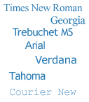
So, returning to my opening remark, the font family for this text you're reading is specified at the top of the page (hidden in the code, of course) as a list of two fonts. In this case: "Arial, Helvetica". Quite simply, this tells your browser to display the text in Arial if the font is available. If it isn't, the browser should use Helvetica instead. It's second place because (a) the majority of people have got Arial installed and (b) because Helvetica is so similar to Arial that it won't adversely affect the page layout if Arial is absent.

While I might have hundreds of fonts installed on my computer, it's possible you might not. Even if you have, you probably won't have the same fonts as me. So that means I am quite limited in my choices.

See the Appendix at the bottom to find out just what those choices are.

Convention

In its short history, the web has already seen a lot of trends come and go. Along comes the Blink tag and suddenly everyone's using it. Equally suddenly, it becomes a bit of an embarrassment. To a designer, it's a no-no.

When I started making web pages, there wasn't a font tag. Hard to believe now, isn't it? You decided what font you wanted to use in your browser settings. So for most Windows users, the world wide web was all in Times New Roman, because that was the default.

The font tag came along in 1995 along with the first wave of people practising "web design" as a career. And those designers led a mass migration away from Times New Roman. Probably because we were sick of the sight of it. Pretty soon, everything was in Arial. Within a year, Microsoft had extended the breadth of choice by introducing its Core Fonts package. These fonts were made freely available and were specifically designed to look good when rendered in a web browser. They included Trebuchet MS and Verdana as a change from Arial, plus Georgia to give us an alternative to Times New Roman.

Oddly, though, professional designers have never embraced Comic Sans in quite the way amateurs have. Mums creating invitations to their infants' birthday parties seem to love it. If you let your teenage nephew make your company's website, there's no bigger give-away than the presence of Comic Sans on the page. (See Fighting the good fight against a very bad font)

Style

But is Comic Sans really that bad? Who am I to say. All I know is, I'd be a brave man to present it to a client as part of a creative pitch. Convention, or for want of a better word, fashion, dictates the paramenters of the designer's choices much more than any personal choice.

This is especially true with a commercial website, which almost always necessitates a conservative approach. A customer expects your website to adhere to certain conventions of layout, navigation and design, so deviating from those conventions means you risk losing their business. Brave indeed.

But what of style? Individuality? Without pioneers in web design, those conventions would remain static forever. Moreover, by apeing bigger, more established websites, web designers do nothing more than condemn their websites to being forever second-best, unprepossessing and forgettable. So maybe it's time to be brave and lead the resurgence of Times New Roman on my next project. But not Camic Sans. I'm not as brave as all that.

Font Tips
  • Less is more. As a rule of thumb, two different fonts on a page is usually ample
  • Think about colour. It can be a striking alternative to using bold face or italics
  • Size is important. Text can be clearly emphasised or de-emphasised by its size and by the amount of space around it, without changing the font or colour
  • Watch the width. A paragraph becomes very difficult to read when there are more than twelve or thirteen words on each line

Appendix

There's a list of common fonts here:
http://www.ampsoft.net/webdesign-l/WindowsMacFonts.html

And these pages list the fonts that come with Office and/or various versions of Windows:
http://support.microsoft.com/kb/837463
http://support.microsoft.com/kb/924623

And these pages list the fonts installed by Mac OS X:
http://support.apple.com/kb/HT2444?viewlocale=en_US
http://en.wikipedia.org/wiki/List_of_fonts_in_Mac_OS_X

Tuesday 3 February 2009

How the World Will See Your Website in 2009

Internet Explorer 8Microsoft Windows Internet Explorer 8 "Release Candidate 1" is now available to download. The term Release Candidate means it's near to completion, might still have a few bugs, and moreover it's not too late for Microsoft to make changes once millions of us have tried it out.

Why should you care?

Principally because this is how your customers will be seeing your website for the foreseeable future. When the IE8 beta came along last year, it looked like bad news for web publishers. Many web pages - even on high-profile sites such as the BBC News - looked a mess.

The Beta software had an option to switch from IE8 mode to "Emulate IE7 mode" if the page was completely illegible. Unfortunately, this required you to shut down your browser and open it up again. And most of us probably don't have the patience to do that. So, when looking at the BBC News website, for instance, the links one would usually expect to see along the foot of the page were found half-way up, obliterating the middle part of the article.

Fortunately, there is good news. On the Release Candidate, "Emulate IE7" has been replaced by a new smart function that allows you to switch between standard view and "Compatibility View" with a single click. So, in the event that your website does look a bit wrong, there's still a chance that customers will be able to see it the way they used to.

What IE8 Can Do

The Microsoft website has a plenty of information about what IE8 does and doesn't do to enhance your browsing pleasure, so no need to go into it all now. Personally, the things I was most pleasantly surprised by were small details, like the improved "Find in page" function (Ctrl+F) and the addition of line numbers along the margin when you select View Source. The silicon.com website has a quick overview in pictures that tells you much of what you need to know about the big functional enhancements.

Slicing Up Your Site with Web Slices

From a designer and developer's point of view, one potentially interesting addition to IE8 is the introduction of web slices. These are intended to allow visitors to your site to "grab" a little piece of it and stick it onto their IE8 toolbar where it can be checked for occasional updates, a little bit like a glorified RSS feed. Of course, it can't be done with any old snippet of HTML - the content needs to be enclosed within a hidden tag like this:

<div id="footy_scores" class="hslice"></div>
where the id is a unique identifier (in other words, if you've got 20 slices on the page, each one needs a unique ID). The slice also has to be tagged with an entry_title, which is not hidden, something like

<h2 class="entry-title">Live Premiership Scores</h2>
Whether you'll want to include web slices on your website will very much depend on how often the site gets updated. If you've got content updating every five minutes or special offers with limited availability, then there's an obvious advantage. Microsoft have provided a style guide download which explains exactly how it's all done.

I can't imagine my clients all clamouring for Web Slices just yet. But it will be interesting to see if they become popular amongst developers or just fall by the wayside. They might even go the way of Microsoft's Active Channels, which pre-dated RSS at a time when the general population really weren't ready for them.